


As a home builder, your website may be the very first impression potential clients have of your business. If your prospect hasn't come across one of your building sites, they're visiting your website! It's essential to create a website for your business that builds trust by showcasing your work, building process, and making it easy to get in touch with your team! Let's explore what should be on a construction website for home builders, with examples.
1. design with clear direction
Defining your prospective customer's pathway, from consideration to signature, will help inform how to set up your website structure.
To start, determine what you and your customer want to achieve. This will help you make decisions about the design, content and functionality of your website.
Define your pathway, desired website outcomes, and use design to facilitate them
Consider who you are targeting. This persona helps articulate everything from your colour palette to website copy and help ensure your website content is framed around your customer's searches and needs.
Example website goals:
- Engagement: Browse portfolio/home designs
- Download a guide
- Book a chat
- Complete enquiry form
- Call you
Think of your website as the intersect between your goals as a business and your prospective customer's. By defining your desired website outcomes, and using design to facilitate them, you'll create a directive pathway for customers that facilitates action.
Your website is the intersect between your goals and your customer's.
Help your customers out
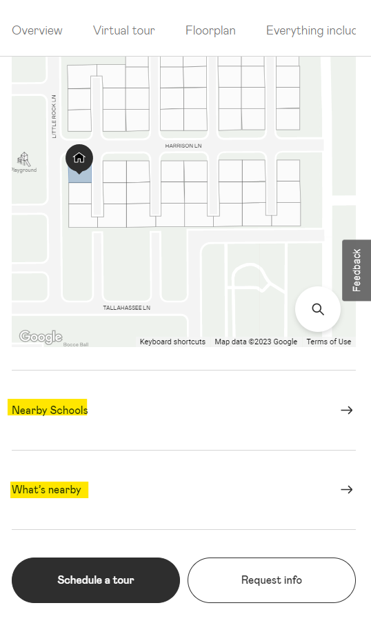
Lennar Homes includes information about build locations that help prospective buyers learn about the area such as what's near the site location. Whether it's Maccas or a school, their buyer is probably interested in what's nearby.Having this on site is super convenient for the prospective buyer and keeps them on the website considering their purchase options.
Setting up these objectives early in will help you track website performance. This is commonly referred to as 'conversion rates'. Conversion rate is the percentage of website visitors that are taking your desired action/s, whether that's making a phone call, completing an enquiry form or browsing your home build options.
Choosing these goals will be critical to ad performance later on, as most digital advertising platforms will optimise towards your website goals.
Tip: the average 'Conversion-Rate' for real-estate is 2.6-7.4%, and home improvement between 3.8-7.2%. Source. Knowing these sort of numbers for your business can help you understand how much you have to pay to per enquiry. For example, if the website you design has a 1% conversion rate, for every 100 people you get to your website through the likes of Paid Per Click advertising, you'll get 1 enquiry.
If you've worked with a conversion rate expert, you may find you're on the upper end of the average conversion rate for your industry, which will significantly boost your advertising returns-on-investment.
2. Clearly Communicate Your Unique Selling Proposition
The best home builder websites are persuasive, clearly communicating their Unique Selling Propositions (USP).
Examples of a USP for a builder:
- We don't just develop homes, we develop communities
- Our homes blend architectural beauty with sustainable living
- Functional small space renovations
- Energy-efficient homes
- Precision built (Maccini uses this one and I love it)
- Smart homes that anticipate your needs
Your Unique Selling Proposition is usually your specialty - whether it be ecofriendly renovations or passive home designs. Why should potential clients choose your services over others? You want your content to be easily understood and highlight the key benefits of working with you.
Highlight the key benefits of working with you.
An example of a building website that effectively communicates its unique selling proposition is Pulte Homes. On their homepage, the company clearly states their mission: 'Build Homes. Improve lives'. They expand on that down the page: 'We build homes and communities; we understand the value of being a good neighbor'. The website's messaging help sets them apart from other home builders. Visitors to the website are quickly able to understand the company's values and make an informed decision about working with the company.
Another example is Sustainable Homes Melbourne that promise 'sustainable home renovations that make life better, guaranteed', or the Marvel Homes website that states that they are 'Sydney's passive house specialists'.

Your USP sums you up and is quickly understood.
How do you write content for a construction website?
Many builders don't like copywriting but don't stress - even Albert Einstein was known as a bad speller. If you're one of those you may like to think about working with a marketing professional or specialist copywriter to work with you on forming your key messaging and content for your website.
When you're writing content for your construction website, avoid industry jargon, waffle and, of course, spelling errors that could make you look unprofessional.
Copywriting tip: Swipe copy from your testimonials.
Here's a sneaky tip: one clever way to write website content for your website that converts well, is to dig through positive feedback from your customers - whether that's in emails, forums, or face-to-face, and keep the best of it to integrate into your website copy.
3. include Conversion-centered design principles
Conversion-centered design uses persuasive design techniques to create a high performing landing page, and website.
For example, white space:
Design Tip: Use white space to draw attention.
We have a tendency to overstuff our website pages with content. This is particularly a temptation if your business has been depending on SEO as a tactic to drive business.
Less can be more. It tends to also convert more.
Big blocks of text can overwhelm and cause prospective customers to lose focus. Use negative space to create room to breathe.
4. High-Quality, Optimised Images and Videos
Visual content is a powerful tool in showcasing renovation or building services. High-quality images and videos provide potential clients with what can be seen as 'proof of service'. An in-depth look at the quality of your work can help you stand out.
Video can help people feel like they've 'met' your team
Video in particular can help people feel like they've 'met' your team, creating brand familiarity. This familiarity is critical in establishing trust, and the faster you create trust the faster you'll get an enquiry, basically.
include your portfolio of work
An example of a construction website that maximises the use of imagery and content is Perry Homes in NSW. Perry Homes showcases their homes using large photos of their homes, as well as interactive maps and virtual tours set up with Matterport pictured below.

Their videos include stories of real customers experience working with their team. The overall design and user experience of the Perry Homes website creates a positive impression for visitors, effectively communicating the company's message and building trust with potential customers.
Your imagery is not just there for show. Choose visuals that showcase people and ideally customers that are relatable to your target market. Every image purpose is to emphasize the benefits of working with you.
Once you have your imagery and video content ready to go, you'll want to set-it up right for the web. Optimised image formats will load faster for users, helping you to look super slick, and keeping people engaged. This is not only important for your customers, but the likes of Google. Tag your imagery with appropriate 'alt tags' to help both search engines and anyone with visual impairments 'read' your images.
For video, whether it's a background video or an embedded video like a YouTube, make sure it's set-up for search engine parameters to ensure search engine crawlers will understand your website properly once it goes live.
5. user-friendly Information Design
All websites need to be what we commonly refer to in the web design world as 'user-friendly'. How this plays out, can really help your relationship with the customer over the duration of your build.
The smoother your website experience, the better the initial perception of your service
First impressions count. Think of it like this: if you start out super smooth, you're setting up the expectation for the client that the build will go smoothly too. Work to create a smooth and interconnected customer experience with an easily navigated website. Provide quick access to important information, such as your services, building process, portfolio, testimonials and contact information.
- Make it easy for users to understand what you offer.
- Minimise distractions like pop-ups or ads (I'm just going to repeat that... NO POP-UPS, please)
- Ask for feedback from your target market, and improve your website based on feedback (there are various means to do this).
Tip: creating a customer journey map can help create a better structure for your website.
6. simple Contact Forms and Calls to Action
Make it easy for potential clients to get in touch with you by including contact forms and calls to action throughout your website.
- Include buttons for scheduling a consultation, using a platform like Calendly like I do for example.
- Enable users to request a quote or call your office directly.
- Create focus in your design, by using spacing, complementary and contrasting colours to guide your audience one goal at a time.
Try not to overcomplicate the process to get in touch with you. You want to make it as easy as possible for the prospective client to find the information they are looking for when they come to your website and get in touch.
Form tip: Try not to use more than 3-5 fields for your forms. Consider that the more you are asking from a customer, the more value you should be trading for it.
Calls To Action For A Builder
Calls-To-Actions (CTA) usually come in the form of you guessed it... buttons. They can be straight forward, like 'contact us'. Better yet, they can illustrate the next step like, 'Show me a plan', 'Take a two-minute tour', 'See If We're A Match'
CTA button tips:
- Match the feeling
- Handle the objection
- Create an actionable next-step
- Make it specific
- "Value" copy often performs better than "action" copy.
Offer "Value" to improve your CTA and overall website performance. For example, "Start Now! No Site Visit Required" is likely to perform better than action copy like, "Start Today". "Quick Assessment", would be likely to perform better than, "Book An Assessment".
Strangely, real-estate website landing pages have been found to perform better when you actually avoid emotional language and stick to the facts. Source. While home improvement landing pages, like home renovation services, are performing better when you use more positive language, than pain points.
So instead of saying, 'avoid being cold this winter', you'd say something like, 'stay snug and warm in winter'.
Include your phone number
For many builders, they can cringe at the idea of putting a phone number on site. It's usually because they're avoiding what some call, 'time wasters'. If you're a builder that's avoiding popping your phone number on site, please consider that the harder you make it for people to contact you, the less leads you will get.
If you want a high performing website, reduce friction. Make it as easy as possible for your website visitors to do what you want them to do - like contact you.
A phone number is also a 'trust signal' for both search engines and well, humans. It has also been found to improve ad performance for campaigns like Google Ads because it demonstrates to Google that your ad provides a direct and convenient way for people to reach your business. These platforms want to help their users after all.
There are many ways to mitigate lower quality leads, other than avoiding having your phone number on site. For example, clear messaging is a very good mitigation strategy. If you only service a certain area, make it clear.
Tip: I'm an independent marketer that has helped many builders with the quality of leads/enquiries, feel free to get in touch if you too need to improve your lead quality.
7. Mobile-centric design elements
With the majority of internet users accessing websites from their mobile devices, it's critical to ensure your site is optimised for mobile, right? A mobile-friendly site provides a better user experience for potential clients and can also positively impact your search engine rankings.
- Use clear fonts that are easily read on small screens.
- Buttons that are wide enough for thumb-action.
- Avoid pop-ups.
- Optimise images so that they load quickly.
An example of a home builder website that deploys many of these principles is Meritage Homes. The homepage includes the phone number, offer and clear messages. You can see from the screenshot below that it's not really a fancy website design, but it is clear.

You don't have to have the flashiest website design to have a high performing website, but it does need to be structured to drive conversion goals. Try not to be tempted to overlook function for design.
You don't have to have the flashiest website design to have a high performing website.
The very best performing websites do tend to look good while doing so, but functionality and practicality can easily trump aesthetics. That's going to count when you tally up your earnings at the end-of-financial-year.
8. Facilitate Trust by including trust elements
Integrate social proof throughout your website to build visitor confidence and prove your credibility as a builder. The more trusted reviews may be independent of your site - such as Trustpilot or Google rating review. Often there are options to 'embed' these reviews on your website.
A poorly designed testimonial can actually make you appear less trustworthy.
Tip: Include a well-framed happy headshot to prove your reviews come from a real human being. Not only will a smile draw attention to the testimonial, but it also reflects how happy your customer can expect to be. Interestingly, including the shoulders in the headshot tends to be perceived as more trustworthy.
what should you include on a construction website for a Home Builder?
Here's a quick checklist on what a high performing home builder website is likely to include:
- A hero section, which is used to convey the main message of the website - likely to be your unique selling proposition.
- User friendly and mobile-friendly design
- Design that creates direction & focus
- Concise copy that reflects your target audience needs
- Photos of real people like your team and happy clients
- Service summary
- Your portfolio of work
- A build process summary that illustrates 'next steps'
- Trust elements - like awards, testimonials and independent reviews
- An about section: providing more info around your unique selling proposition, like your story and mission
- Clear calls-to-action buttons such as, 'enquire for a quote'
- Your phone number :)
- Fast-loading elements - avoid extra tracking scripts for example and gifs which can increase load times.
- Simple contact form/s that are easy to fill-out
Here's an example mockup of mobile homepage wireframes for a home builder to help give you context:

A well-designed home builder website will help you streamline your prospective customer's experience with you as a builder, help clients understand your build process and enquire about your services, efficiently.
Remember, websites evolve
Your website is not a stagnant thing. If it is, it's like creating a business card and leaving it stashed in your desk draw. Nobody gonna see that!
Websites grow, and that growth will help you grow your online presence.
If you need advice specific to your business, I've worked with many home builders to improve their website structure and messaging. Here's an example of one of my projects.
You may also be interested in: Campaigns for home builders.


